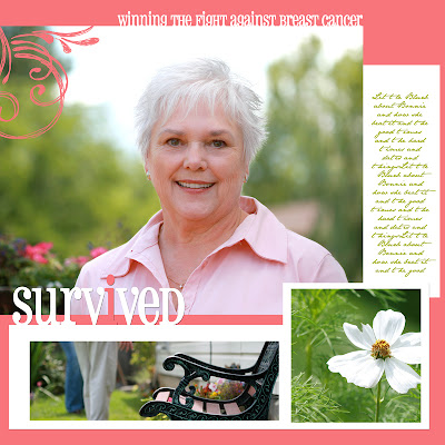
Scrap Pink 2007 is coming up Sept 28-30th, and for work I get to do a layout featuring, the lovely Bonnie. I met her yesterday as a result of a "casting call" for a survivor of breast cancer - willing to let me take their picture for this layout. Bonnie! THANK YOU for modeling! Here's the rough demo in Photoshop Elements 4 of how to brighten and touch up a photo....
This is the final photo used in the layout:
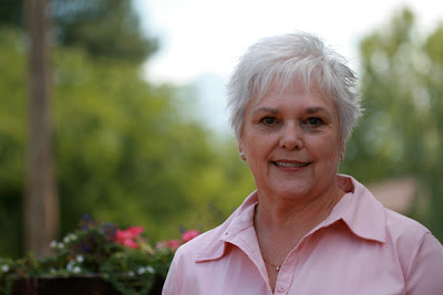
*note I actually used the wrong pic for these screen shots, that's why her smile's
not as happy! whoops....
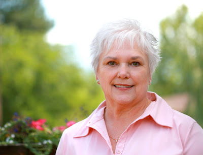
And here's my original:
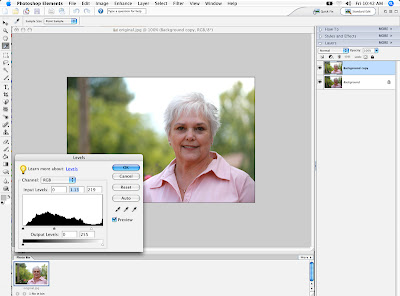
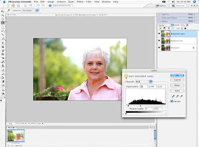
I started off by dragging my image onto the "new layer" button, and then changing the levels. I wanted Bonnie to be brighter (Enhance>Adjust Lighting>Levels). I take the "white" slider on the right and drag it to where the black starts to go up the hill. I also took the middle "gray" slider and took it a bit to the right to lighten the midtones. Click ok.
Next, I made the new copy more saturated with color (Enhance>Adjust Color>Adjust Hue/Saturation). I just increased the "saturation" to +24. Click ok.
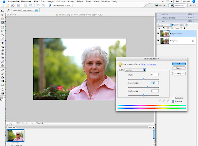
Um...... then I decided that I might want bonnie even lighter, so I made a new layer (from the copy) and used levels again to lighten it a bit more.
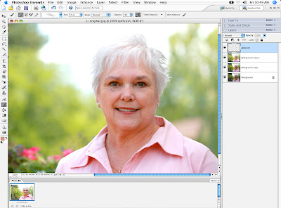
I'm a fan of airbrushing, so I gave a little bit of light under her eyes, but selecting a soft edges round brush, setting the opacity (top toolbar) to 17% and created a new layer (so I could flip it on and off, or delete it if necessary) titled airbrush. With the brush selected, hold the alt key and you will see the brush tip change to the "dropper." Pick a color from her face near where you want to airbrush and lightly start glazing over the chosen areas. Remember! Make them look "fresh" not plastic - don't airbrush too much or too solid!
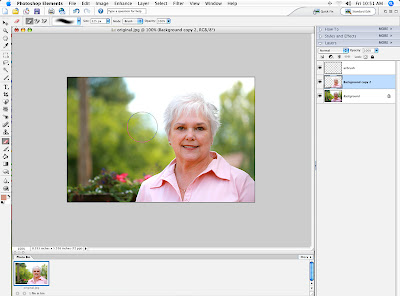
I merged the second layer with the background layer (hit ctrl+E while on the second layer and it will merge it down one layer). Now I have decided that in all that lightening , I've lost some of the top of her gorgeous platinum hair, and I also liked the background a little darker and more "contrast-y" So I am erasing with a soft eraser the top layer (with her the lightest). I left erased all of the background and part of the top of her hair, so that the darker version underneath would show. Then I cropped out the tree on the left, with the crop tool, and saved it as a .jpeg.

3 comments:
I happened upon your site via a roundabout link from Nicole Seitler's blog. What a find! I've dabbled in bookmaking, am teaching myself Photoshop, and am a breast cancer survivor. You did a wonderful job on this. I'm sure Bonnie was thrilled to take part in this endeavor. I'll be back to visit often!!
that is such a wonderful layout. You did a great job on it. I love the picture of the cosmos in the corner.
OMG - thanks so much for walking me through this Natalie. I fool around my own way with lighting, levels, etc. on PSE 4 since I'm self-taught (which means most of the time don't know what I'm doing). So it was great to see what/how someone else did their's.
If you're interested, what I'd LOVE to see in the future is the same kind of thing to give a photo like this some urban pop - that edgey, kinda overblown, color saturated look that's so cool. But happy w/whatever you choose! Thanks so much for your time and freebies!!!! So happy to have found your site. xo
Post a Comment